Technology changes fast, and website design trends are no different. Design elements and website features that were once modern and innovative may have become tired, overdone, and cliched in recent years. The last thing you want as people arrive at your site is to lose conversion because your website looks outdated or ignores critical web standards.
Fortunately, our award-winning web design team keeps up with all the latest website design and development trends to create highly functional, easy-to-use websites that perform well and look fantastic. We want to share some of the latest innovations, digital technology trends, standards, and forecasts for 2022.
Spoiler Alert
It looks like 2022 will bring bold colors to the forefront with a high focus on page speed and user experience.
See how our award-winning marketing and web design team can keep you up to date with all the latest trends.
Thirty Website Design Trends and Standards for 2022 and Predictions for the Next Year
There will always be aspects of web design that are never going away – user-friendly navigation, data security, and fast load times should just be a given on your website. However, you can keep your site at the forefront of design and search engines by adding some of these innovative website features and elements.
Table of Contents
THE LATEST WEB DESIGN TRENDS AND PREDICTIONS
1Bold Color
2Website Load Time and Page Speed
3Smart Content Load
4Personalized Content
5Progressive Lead Nurturing Forms
6Chat Bots Become Human-like
7Voice Activated Interface
8Accessibility and Availability
9Interactivity
10VR
11Micro Interactions
12Micro Animation
13Organic Shapes
14Minimalism (Flat Design)
15Color to Evoke Certain Moods
16Thumb-Friendly Mobile Navigation
17Smart Video
18Material Design
19Text-Only Hero Images
20Vintage-Inspired Colors & Typography
21Bold Fonts
22Data Visualization
23Dark Mode
24White Space
25Illustrations
26Full Height Homepage Hero
27Blending Photos with Graphical Elements
28Gradients
29Interactive 3d Content
30Frosted Glass Effects
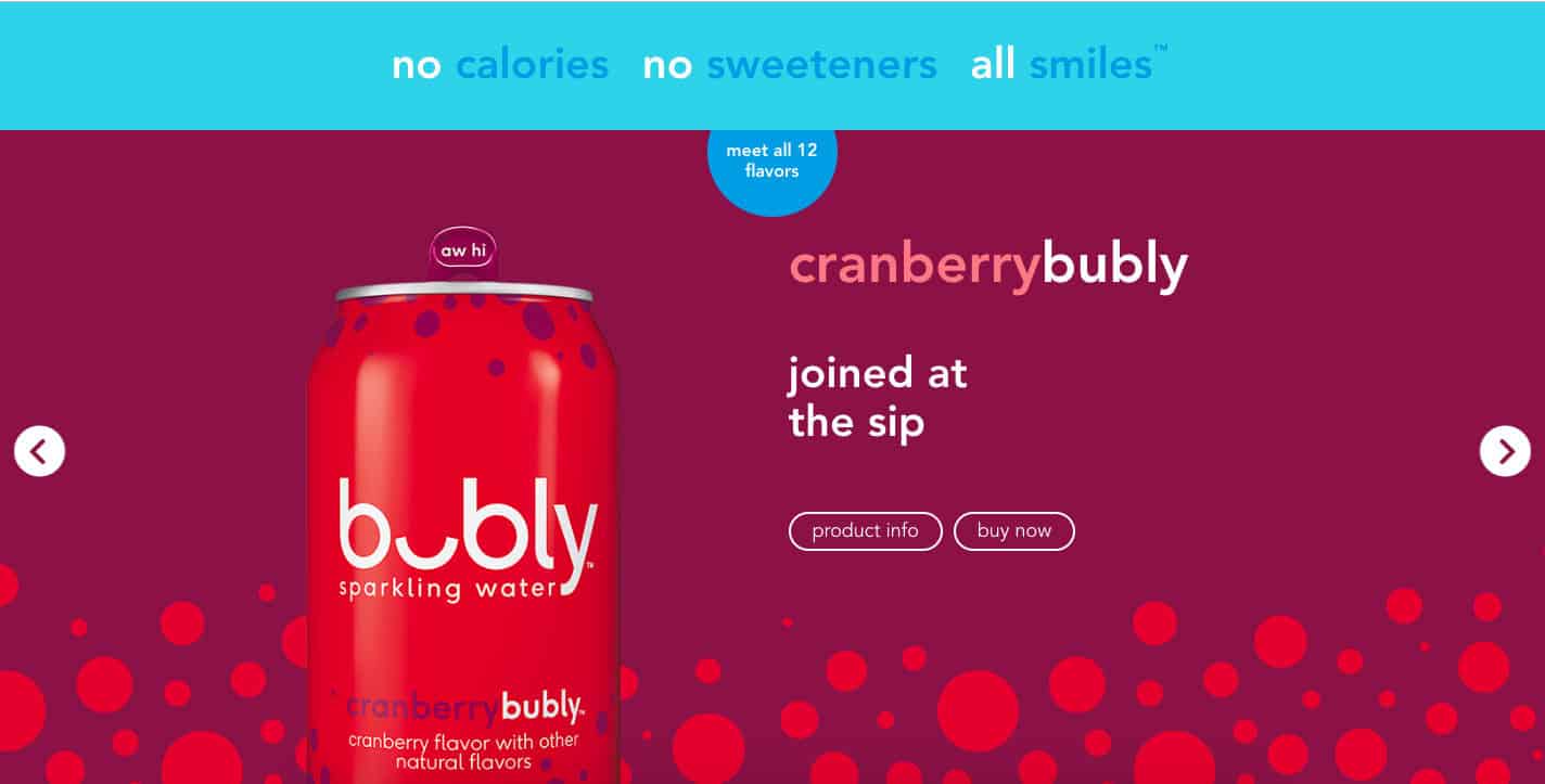
1. Bold Color
Colorful minimalism goes hand-in-hand with one of 2022’s most prominent web design trends: color! Bold, bright, saturated colors help your brand stand out from the soft neutrals that many companies have chosen over the past few years.
bubly, the sparkling water company, is an excellent example of how a site can use bold, saturated color without overwhelming the eye. Their branding is all about colorful cans, and their website is an extension of that:
They’re checking off a few 2022 web design trends: organic shapes, minimalism, and bold color!
2. Website Load Time and Page Speed Are King
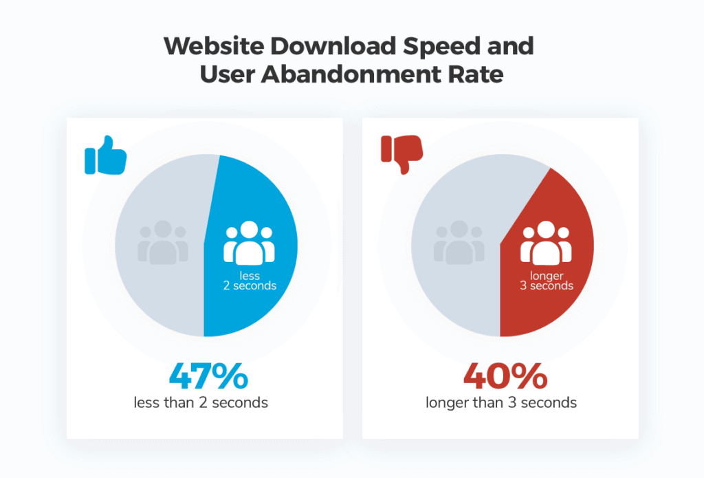
One of the most important web design standards is ultra-fast load time. Quick loading times have been essential factors in UX and SEO for years, and it continues to be a top priority for websites that want to rank well and convert better.
Studies say that more than half of internet browsers expect a website to load fast and no more than two seconds after clicking a link. If it takes more than three seconds to load your site, your visitors most likely will leave, and it’s not likely they’ll be back, ever again!
Website performance has a direct impact on a companies bottom line. Pinterest reduced perceived wait times by 40%, and this increased search engine traffic and sign-ups by 15%. (citation)
You might have heard the term “location, location, location” from your real estate agents when looking for investment properties. At TheeDigital, we focus on “conversion, conversion, conversions.” Website loading times are a standard metric we look at to ensure good user experience.
DIVE DEEPER
Spring Cleaning Your Website During Slow Periods
3. Smart Content Load for a More Enjoyable User Experience
Many of us might be guilty of having resource-heavy websites with many graphical elements and third-party integrations that can slow our sites down. Fortunately, there are many different ways to develop smart websites that download only the content that you see and need.
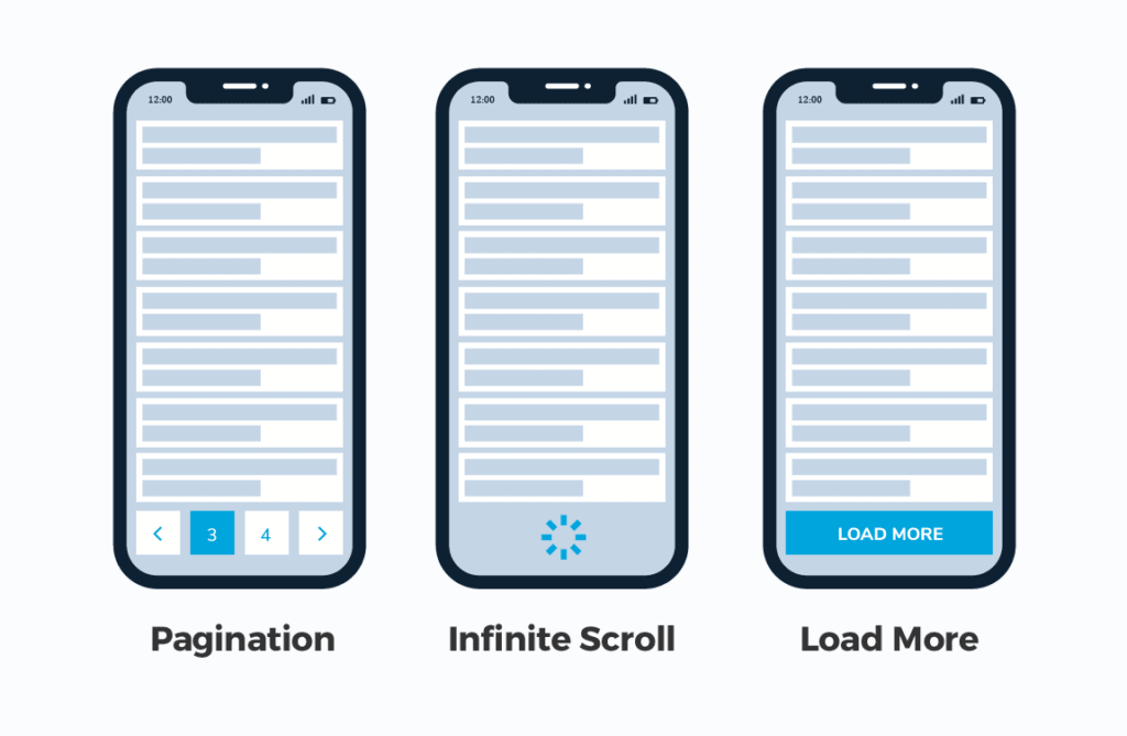
Lazy loading and infinite scroll are not brand new technologies. The top social networks have been using this for years, especially when it comes to infinity scroll. The approach is also popular with long (one) page websites.
All websites should consider how implementing one or two technological approaches might help them outrank or outperform there competition. These features can help improve the user experience for all website visitors, which can improve your conversion rate and ranking.
Lazy Load ensures the web browser (like Google Chrome, Safari, and Firefox) will download only the content you see on the screen without wasting valuable server resources and TIME to load offscreen content that might never be seen.
Many website visitors never reach the bottom of a webpage. So why load that content and increase site load times. A better approach is loading the content as they begin scrolling down the page and getting closer to it.
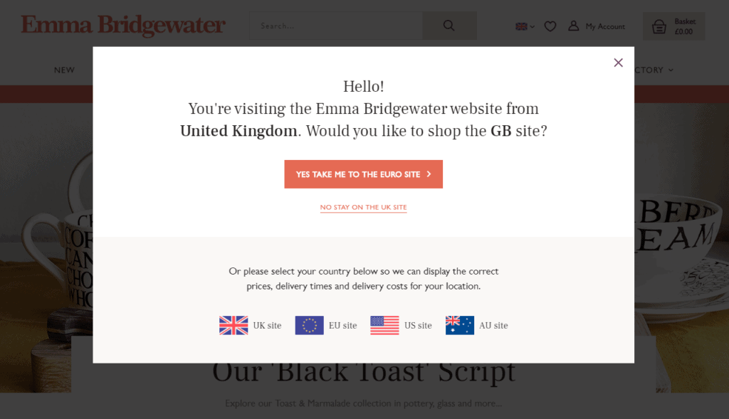
4. Personalized Content According to Your Geolocation and Browsing History
Perhaps you have visited a website and then come back to it a few hours or days later to see that the content has changed. When you pull it up on your phone for the first time or on another browser, you see the original content you saw the first time you visited the website.
It’s no secret, most advanced websites track our browsing history and know our locations. But cutting edge web agencies will advise their customers to display dynamic content, content based on past user behavior, or what we know about a user. Not generic content made to serve everyone.
Custom content created for users returning to your website for a second or third time can increase conversion.
You experience this every time you use Google as a search engine. People looking for a nearby restaurant in Raleigh, North Carolina, will see different results than users in other towns.
A great directory website will also recognize the type of food you like. If you reviewed or saved Italian restaurants in the past, it might make sense to weigh Italian restaurants higher in your search results.
Another example is when you visit your bank’s website for the first time, and you need to add your username and mark your browser as “trusted.” When you come back, the bank will know you are an individual or a business customer. So, they will push their residential or commercial offerings according to your customer status.
Personalized content is probably more important for e-commerce website owners. Displaying recently viewed, saved, or liked products for online shoppers can lead to increased conversions. Highlighting abandoned cart contents for returning customers is also crucial to maintaining a higher conversion rate.
Without realizing it, personalized website content has become more expected by users; and it will be an even more dominant focus for a successful web presence.
5. Progressive Lead Nurturing Forms Integrated with Your CRM Tool
Online lead generation forms are one of the most important elements of a marketing website. We want to get to know a lot about our website visitors, but we can’t ask too many questions at any particular time. We place progressive/dynamic contact forms on the landing pages and display fields according to the lead’s journey.
Ideally, we don’t want to display too many fields in a form, but we can always adjust the form fields according to the data that we already know about our leads. We might ask the name, company, and email address at the first conversion and then ask the phone number, title, company size, company revenue fields at the next conversion opportunity.
Our CRM, like HubSpot, stores the information of our leads. By integrating it with our website. The CRM can recognize the lead when they come back to our websites and display form fields on the landing pages that we don’t know about the contact.

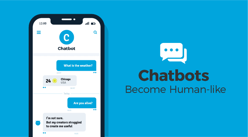
6. Chatbots Become Human-like
Chatbots are another feature that has been popular for a few years and will continue to be relevant in 2022. As artificial intelligence and machine learning continue to get more sophisticated, we expect to see chatbots become the norm for simple customer service requests and “personal shopping.”
For example, if a customer visits your website, looking for phone support and the chatbot knows they have an available free phone upgrade. The chatbot can let them know about the upgrade. This can lead to a positive experience for the customer and save the business the customer support cost associated with talking to a live person.
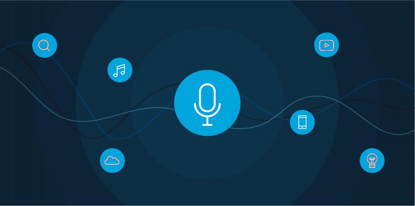
7. Voice-Activated Interface
The way we access information is changing – instead of typing into Google, we now ask a question or make a demand. This means web design is adjusting to keep up with the prevalence of voice chatbots and virtual assistants. While a voice-activated interface isn’t commonplace for most websites, this emerging trend isn’t going anywhere in the foreseeable future.
We can expect to see more and more websites integrating voice search as an option to traditional text search.
DIVE DEEPER
How Voice Search is Changing Digital Marketing & SEO
8. Accessibility and Availability
Inclusivity and accessibility are more than a trend, but there is a growing need for web design to factor in the needs of people with disabilities. Having a site that every visitor can navigate and interact with is more than just part of good customer service and providing an excellent experience. It can increase conversion, boost your SEO, and help you reach a bigger audience.
Elements that improve accessibility include:
Creating strong color contrast between text and backgrounds;
Adding focus indicators, such as the rectangular outline that shows up around links when using keyboard navigation;
Using labels and instructions with form fields rather than low-context placeholder text;
Using functional alt tags for images (which also boosts SEO!);
9. Interactivity
Adding interactive sections to your website is a great way to provide value for visitors, get them to engage with your website, and learn more about them.
Suppose you were a realtor and added a mortgage calculator to your website. You’re offering value to your visitors while also learning more about them based on the data being inputted into your calculator.
Examples of interactive marketing include:
Assessments like quizzes
Polls and surveys
Calculators
Contests

10. VR
VR experiences on websites will continue to increase over the coming years. Think of sites like Airbnb that let you tour a rental before you book a reservation. Or the furniture site IKEA’s ability to showcase what a sofa would look like in your room.
VR can be a powerful tool for a website to serve useful, meaningful content to a site visitor in a way that helps them make buying decisions.

11. Micro Interactions
On a website, micro-interactions are small animations that offer subtle feedback to users. We’re all used to seeing a link change colors when a user mouses over it. With the focus on micro interactions, that same experience might be given more attention to stand out a little bit more. Such as having the mouse course change into a different image depending on the link it is hovering over.
12. Micro Animation
As you might have guessed from the name, micro animations are small animations. But in this case, small doesn’t mean insignificant. Micro animations are extremely helpful when it comes to guiding users through their interactions with your website. They can also add an element of playfulness to your site like Smashmallow did with the micro animations in their hero image:
Micro animations have been popular for a few years, but in 2022, it’ll be about using them organically. As our UI/production designer explained, we’ll be thinking about how things move, if they’re on a curve or wheel instead of on a flat plane.
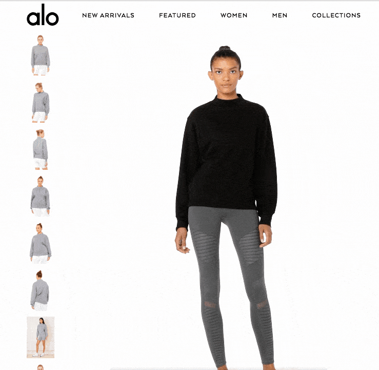
One of the latest web design trends for e-commerce sites is using micro animations to enhance user experience and give shoppers a taste of their products. This yoga clothing store is already using micro animations to show shoppers how their clothes fit and move on real people:
13. Organic Shapes
Geometric shapes were a big website design trend in 2020, but in 2022, it’s all about organic shapes. Organic or fluid shapes are anything that doesn’t involve straight lines. Think of the shapes that happen in nature, like hills, the edges of a lake or river, and how they are asymmetrical and winding.
Fluid shapes are a great way to break up sections of a website without harsh lines or angles. They’re also great to use in the background, like how Android uses circles behind products on their homepage: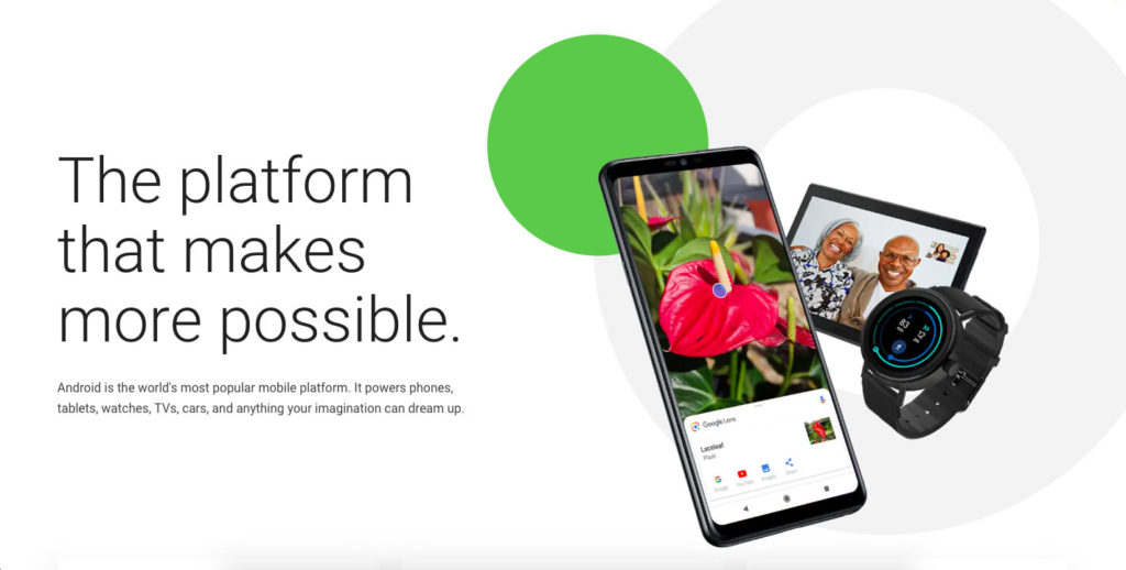
14. Minimalism (Flat Design)
Minimalism, sometimes called “flat design” isn’t a new trend in web design. Still, it has typically been associated with a lot of white space (think Apple.) In 2022, we expect people will be experimenting with colorful minimalism. It doesn’t have to be all white to be minimalist.
A great example of a site that does colorful minimalism well is Shopify. Each page of their website features a bold background color with clean text and minimal design elements to create an attention-grabbing and easy-on-the-eyes page. They’re proof that minimalism doesn’t have to be stark or boring.

15. Color to Evoke Certain Moods
Along with bold color, we think using color mindfully to evoke certain moods will be significant in 2022. Color psychology, the study of color’s impact on human behavior, has been around for centuries, and marketers have used it to help sell for nearly as long.
While the way we interpret colors has a lot to do with our perceptions, some general feelings are associated with colors. For example, green typically denotes nature and natural products while red symbolizes energy and passion.
In 2022, we think web designers will focus on using color mindfully to evoke the mood(s) and feeling(s) a site is meant to elicit.
Want to Improve Your Website Performance?
We can provide a personalized website assesment and one on one consultation.
REQUEST A FREE WEBSITE AUDIT
16. Thumb-Friendly Mobile Navigation
Responsive design isn’t an option anymore. Your site should work well and be easy to use on mobile devices. But in 2022, web design will continue to be focused on creating websites that are thumb-friendly.
What exactly is “thumb-friendly”?
We’re talking about the way we use our phones. If you’re reading this on your phone right now, look at how you’re holding it. Your fingers are probably wrapped around the back of your phone (or around a phone grip), leaving your thumb to do all the work. You probably look like this.
Spooky, huh?
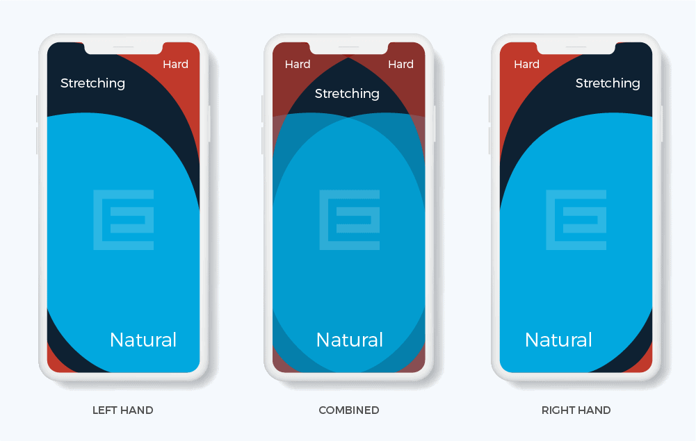
Not really. That’s how most of us use our smartphones, and that’s why thumb-friendly navigation is essential. Putting the navigation bar, menu, and even contact buttons in the space your thumb can reach (the center of the screen) makes your site more comfortable to use and improves your UX tenfold.
Here is a great graph showing the thumb-friendly areas of a phone screen:
17. Smart Video
Video has long been touted as a must-have for websites. People love videos! Video is engaging! It’s the most effective online marketing tool!
While video is great, it needs to be thought out. That’s what smart video is about: video with a purpose and meaning. Gone are the days of embedding a YouTube video on your site just to have one. One well-thought-out, high-quality video is better than a dozen haphazardly assembled ones.
The way CEI uses video in their hero image is eye-catching but not intrusive. It is also a fun visual representation of what they do: provide affordable printers and copiers to businesses in Raleigh.
18. Material Design
Material design is a design language that was introduced by Google back in 2014. Traditional web design looks flat. Material design is about using color and shadows to mimic the physical world and its textures.
Google’s icons for its software suite is an excellent example of material design:
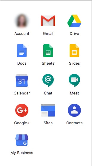
The shadows on the Gmail envelope and the calendar are especially good examples of material design. It’s very subtle but goes a long way in making the icons look three-dimensional. We expect to see a lot more material design in 2022!
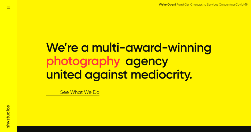
19. Text-Only Hero Images
Newspapers always put their most eye-catching, important information “above the fold” to increase sales. The website equivalent of this is at the top of a page and is called the “hero section.” A current trend to catch internet users’ attention who are bombarded by different web pages every day is removing the typical background image in the hero section and replacing it with eye-catching typography. A bold, unique font could be just the thing to get a user’s attention quickly.
20. Vintage-Inspired Colors & Typography
It’s true that the older we get, the more we look to the past as a time that was simpler and better. Tapping into an audience’s sense of nostalgia doesn’t merely create a throwback on the webpage; it mixes vintage pieces with modern style. Try mixing vintage-inspired fonts and colors with contemporary imagery for an ultra-trendy look.

21. Bold Fonts
Visiting a lot of websites for leading corporations will show you that bold typography is on-trend. With heavy, bold fonts, the reader is instantly aware of the message, not necessarily the imagery. Combining these large fonts with neutral colors further emphasizes the headlines, quickly becoming an “image” of their own.

22. Data Visualization
Communicating data in an engaging way is a struggle. But the struggle is worth it, because using data visualization takes advantage of the fact that humans are visual creatures, and still conveys the message you need to get across. Data visualization creates images out of your data that engage your reader and makes them want to learn more about your brand. Infographics and graphs are some of the most popular ways to bring data to life.
23. Dark Mode
Dark mode web designs serve a couple of different functions. On the practical end, they help reduce eye strain, a concern for many as we are spending more and more time looking at screens. On the aesthetic end, dark mode easily creates an ultra-modern look for your website while giving you the ability to highlight other design elements just by darkening the elements that surround it.
24. White Space
The use of white space is about giving content room to breathe, not trying to cram the most information possible on the screen. The experience is more relaxing for your website visitors, the content stands out better, and readability is improved.
White space is just the term for the spacing we give between elements. It does not have to be white, as long as the area is empty. This is why it’s also known as “negative space.”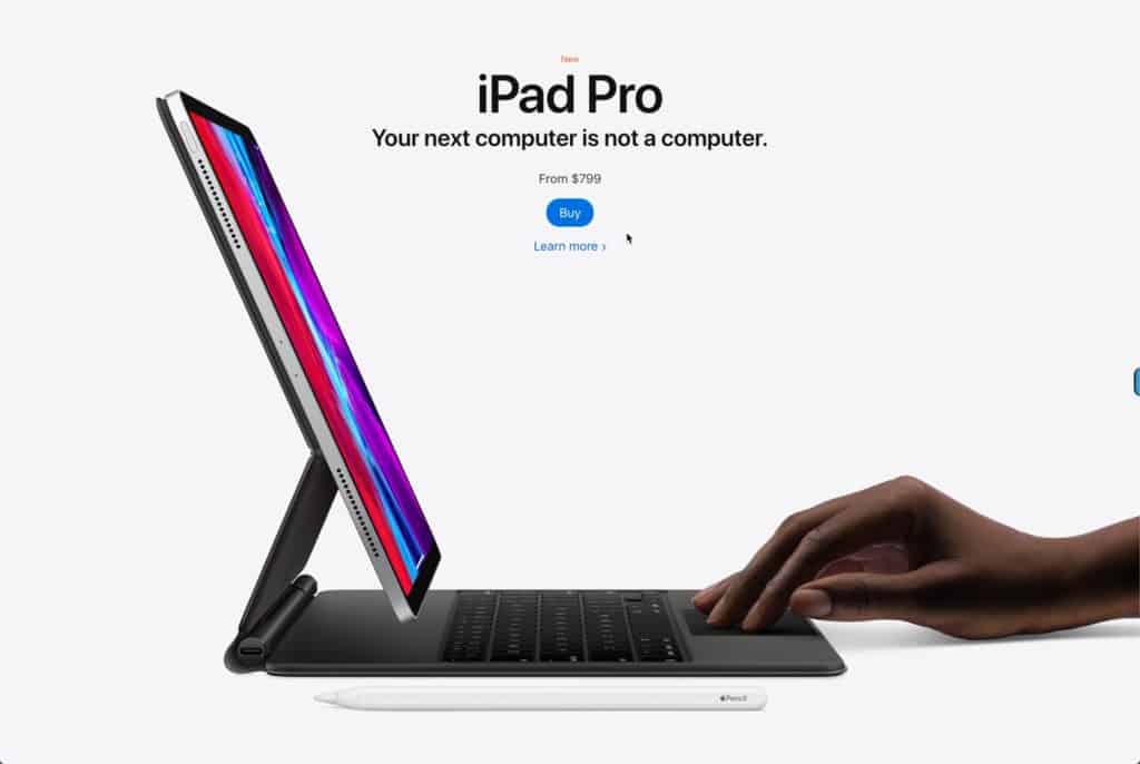
25. Illustrations
Sometimes browsing the web feels like seeing the same stock photo used across many websites. It can make a website feel generic and bland.
Custom illustrations can help your website stand out and feel like something fresh to website visitors. Since you will be creating illustrations from scratch, they can more accurately represent your company and branding, and enhance the page’s subject matter.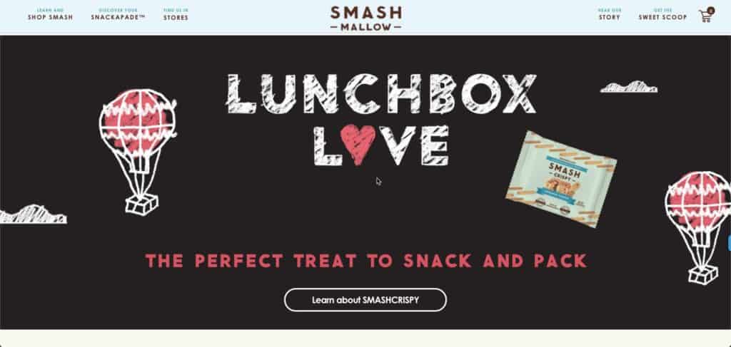
26. Full Height Homepage Hero
Like a giant billboard, making your homepage hero section full-height can focus your users’ attention and serve as distraction-free messaging.
Think of full-screen hero sections as an opportunity for great storytelling. Just keep in mind that images will crop differently based on browser dimensions. You should use an image that will accommodate accordingly.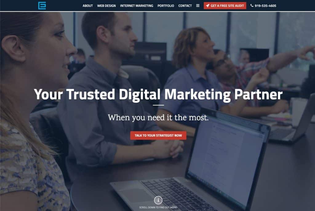
27. Blending Photos with Graphical Elements
You might have noticed overlapping graphics on images in your social media feed. This mixing technique brings a level of creativity and fun to a typical image.
The trend is also catching on with websites. Mixing photography with graphics can reinforce your company branding and keep website visitors engaged with your content.
28. Gradients
Gradients are a long time trend that has evolved from subtle color overlays to eye-catching backgounds.
Gradients can be used to add depth, serve as a striking background, or subtly to add texture to an illustration. We increasingly see it used in bigger and bolder typography.
This trend has staying power. We’re excited to see the continual evolution of its use on websites.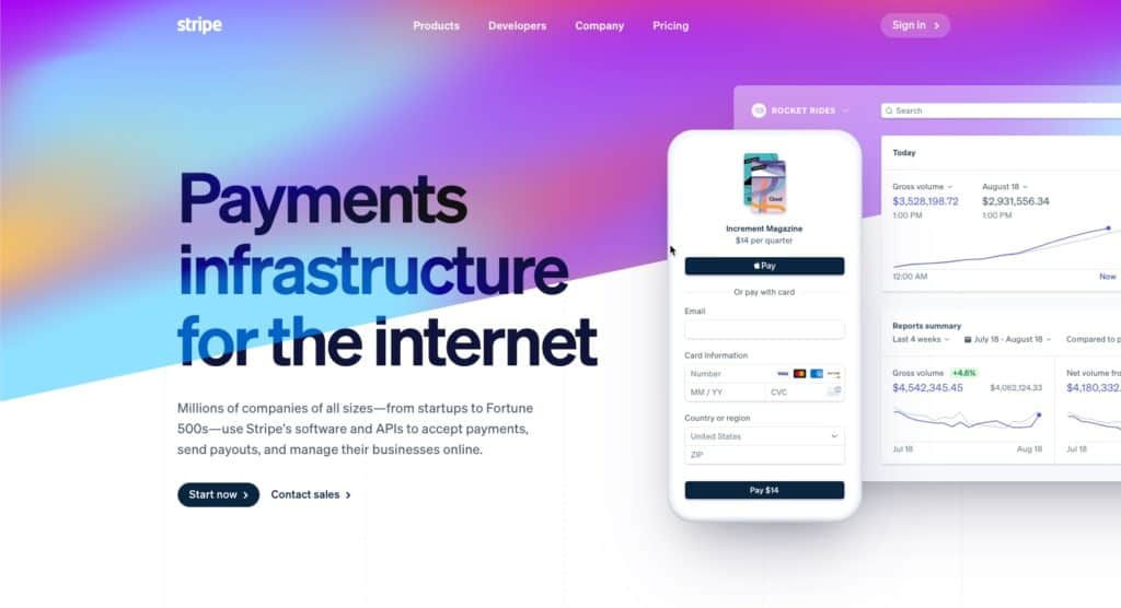
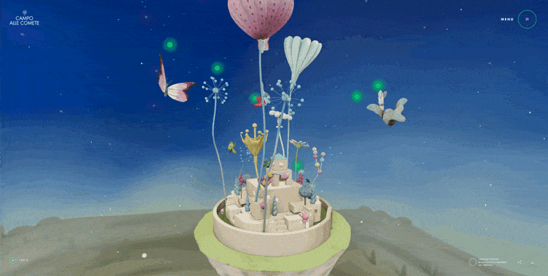
29. Interactive and Static 3D Content
Thanks to maturing web technology and web designers wanting to stand out from the average webpage, 3D elements that users can interact with have been increasingly used.
The results can be breathtaking – like the use of interactive 3D content on the Campo Alle Comete website.
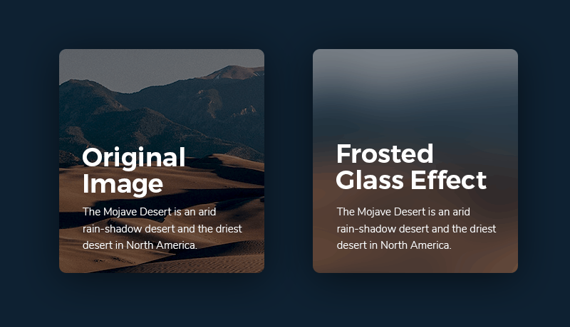
30. Frosted Glass Effects
Recent advances in web technology have allowed the easy implementation of the frosted glass effect on websites. The blurry appearance of elements behind the frosted glass overlay helps add color to an area while also allowing text or objects to appear over the image and remain readable.
The effect has become a popular option in a designer’s tool belt and increasingly been used as a background in place of gradients.
Ongoing Web Design Trends and Website Development Standards
There are a few popular trends from the past few years that will continue to be significant in the upcoming years.
1. Mobile First Design
We mentioned that responsive/mobile-friendly web design isn’t optional anymore. Your site should be designed with mobile in mind first. Mobile searches overtook desktop searches way back in 2015. Since the beginning of 2017, mobile traffic has accounted for nearly half of all web traffic worldwide. More than good UX, Google has ranked mobile-friendly sites more favorably since 2018. Yep, mobile-first design is another drop in your SEO bucket.
2. SSL Certificates
SSL certificates are less a trend and more of a standard security measure for websites. SSL stands for Secure Sockets Layer, and the certificate is installed on your web server. It serves two purposes: it authenticates the website’s identity, which guarantees visitors that they’re not on a bogus site, and it encrypts the data being transmitted.
This ensures a private “conversation” between your website and your visitors. If your site doesn’t have an SSL certificate, getting one should be a priority in 2022, especially if you own an e-commerce site!
Fortunately, our award-winning web design team keeps up with all the latest website design and development trends to create highly functional, easy-to-use websites that perform well and look fantastic. We want to share some of the latest innovations, digital technology trends, standards, and forecasts for 2022.
Spoiler Alert
It looks like 2022 will bring bold colors to the forefront with a high focus on page speed and user experience.
See how our award-winning marketing and web design team can keep you up to date with all the latest trends.
Thirty Website Design Trends and Standards for 2022 and Predictions for the Next Year
There will always be aspects of web design that are never going away – user-friendly navigation, data security, and fast load times should just be a given on your website. However, you can keep your site at the forefront of design and search engines by adding some of these innovative website features and elements.
Table of Contents
THE LATEST WEB DESIGN TRENDS AND PREDICTIONS
1Bold Color
2Website Load Time and Page Speed
3Smart Content Load
4Personalized Content
5Progressive Lead Nurturing Forms
6Chat Bots Become Human-like
7Voice Activated Interface
8Accessibility and Availability
9Interactivity
10VR
11Micro Interactions
12Micro Animation
13Organic Shapes
14Minimalism (Flat Design)
15Color to Evoke Certain Moods
16Thumb-Friendly Mobile Navigation
17Smart Video
18Material Design
19Text-Only Hero Images
20Vintage-Inspired Colors & Typography
21Bold Fonts
22Data Visualization
23Dark Mode
24White Space
25Illustrations
26Full Height Homepage Hero
27Blending Photos with Graphical Elements
28Gradients
29Interactive 3d Content
30Frosted Glass Effects
1. Bold Color
Colorful minimalism goes hand-in-hand with one of 2022’s most prominent web design trends: color! Bold, bright, saturated colors help your brand stand out from the soft neutrals that many companies have chosen over the past few years.
bubly, the sparkling water company, is an excellent example of how a site can use bold, saturated color without overwhelming the eye. Their branding is all about colorful cans, and their website is an extension of that:
They’re checking off a few 2022 web design trends: organic shapes, minimalism, and bold color!
2. Website Load Time and Page Speed Are King
One of the most important web design standards is ultra-fast load time. Quick loading times have been essential factors in UX and SEO for years, and it continues to be a top priority for websites that want to rank well and convert better.
Studies say that more than half of internet browsers expect a website to load fast and no more than two seconds after clicking a link. If it takes more than three seconds to load your site, your visitors most likely will leave, and it’s not likely they’ll be back, ever again!
Website performance has a direct impact on a companies bottom line. Pinterest reduced perceived wait times by 40%, and this increased search engine traffic and sign-ups by 15%. (citation)
You might have heard the term “location, location, location” from your real estate agents when looking for investment properties. At TheeDigital, we focus on “conversion, conversion, conversions.” Website loading times are a standard metric we look at to ensure good user experience.
DIVE DEEPER
Spring Cleaning Your Website During Slow Periods
3. Smart Content Load for a More Enjoyable User Experience
Many of us might be guilty of having resource-heavy websites with many graphical elements and third-party integrations that can slow our sites down. Fortunately, there are many different ways to develop smart websites that download only the content that you see and need.
Lazy loading and infinite scroll are not brand new technologies. The top social networks have been using this for years, especially when it comes to infinity scroll. The approach is also popular with long (one) page websites.
All websites should consider how implementing one or two technological approaches might help them outrank or outperform there competition. These features can help improve the user experience for all website visitors, which can improve your conversion rate and ranking.
Lazy Load ensures the web browser (like Google Chrome, Safari, and Firefox) will download only the content you see on the screen without wasting valuable server resources and TIME to load offscreen content that might never be seen.
Many website visitors never reach the bottom of a webpage. So why load that content and increase site load times. A better approach is loading the content as they begin scrolling down the page and getting closer to it.
4. Personalized Content According to Your Geolocation and Browsing History
Perhaps you have visited a website and then come back to it a few hours or days later to see that the content has changed. When you pull it up on your phone for the first time or on another browser, you see the original content you saw the first time you visited the website.
It’s no secret, most advanced websites track our browsing history and know our locations. But cutting edge web agencies will advise their customers to display dynamic content, content based on past user behavior, or what we know about a user. Not generic content made to serve everyone.
Custom content created for users returning to your website for a second or third time can increase conversion.
You experience this every time you use Google as a search engine. People looking for a nearby restaurant in Raleigh, North Carolina, will see different results than users in other towns.
A great directory website will also recognize the type of food you like. If you reviewed or saved Italian restaurants in the past, it might make sense to weigh Italian restaurants higher in your search results.
Another example is when you visit your bank’s website for the first time, and you need to add your username and mark your browser as “trusted.” When you come back, the bank will know you are an individual or a business customer. So, they will push their residential or commercial offerings according to your customer status.
Personalized content is probably more important for e-commerce website owners. Displaying recently viewed, saved, or liked products for online shoppers can lead to increased conversions. Highlighting abandoned cart contents for returning customers is also crucial to maintaining a higher conversion rate.
Without realizing it, personalized website content has become more expected by users; and it will be an even more dominant focus for a successful web presence.
5. Progressive Lead Nurturing Forms Integrated with Your CRM Tool
Online lead generation forms are one of the most important elements of a marketing website. We want to get to know a lot about our website visitors, but we can’t ask too many questions at any particular time. We place progressive/dynamic contact forms on the landing pages and display fields according to the lead’s journey.
Ideally, we don’t want to display too many fields in a form, but we can always adjust the form fields according to the data that we already know about our leads. We might ask the name, company, and email address at the first conversion and then ask the phone number, title, company size, company revenue fields at the next conversion opportunity.
Our CRM, like HubSpot, stores the information of our leads. By integrating it with our website. The CRM can recognize the lead when they come back to our websites and display form fields on the landing pages that we don’t know about the contact.
6. Chatbots Become Human-like
Chatbots are another feature that has been popular for a few years and will continue to be relevant in 2022. As artificial intelligence and machine learning continue to get more sophisticated, we expect to see chatbots become the norm for simple customer service requests and “personal shopping.”
For example, if a customer visits your website, looking for phone support and the chatbot knows they have an available free phone upgrade. The chatbot can let them know about the upgrade. This can lead to a positive experience for the customer and save the business the customer support cost associated with talking to a live person.
7. Voice-Activated Interface
The way we access information is changing – instead of typing into Google, we now ask a question or make a demand. This means web design is adjusting to keep up with the prevalence of voice chatbots and virtual assistants. While a voice-activated interface isn’t commonplace for most websites, this emerging trend isn’t going anywhere in the foreseeable future.
We can expect to see more and more websites integrating voice search as an option to traditional text search.
DIVE DEEPER
How Voice Search is Changing Digital Marketing & SEO
8. Accessibility and Availability
Inclusivity and accessibility are more than a trend, but there is a growing need for web design to factor in the needs of people with disabilities. Having a site that every visitor can navigate and interact with is more than just part of good customer service and providing an excellent experience. It can increase conversion, boost your SEO, and help you reach a bigger audience.
Elements that improve accessibility include:
Creating strong color contrast between text and backgrounds;
Adding focus indicators, such as the rectangular outline that shows up around links when using keyboard navigation;
Using labels and instructions with form fields rather than low-context placeholder text;
Using functional alt tags for images (which also boosts SEO!);
9. Interactivity
Adding interactive sections to your website is a great way to provide value for visitors, get them to engage with your website, and learn more about them.
Suppose you were a realtor and added a mortgage calculator to your website. You’re offering value to your visitors while also learning more about them based on the data being inputted into your calculator.
Examples of interactive marketing include:
Assessments like quizzes
Polls and surveys
Calculators
Contests
10. VR
VR experiences on websites will continue to increase over the coming years. Think of sites like Airbnb that let you tour a rental before you book a reservation. Or the furniture site IKEA’s ability to showcase what a sofa would look like in your room.
VR can be a powerful tool for a website to serve useful, meaningful content to a site visitor in a way that helps them make buying decisions.
11. Micro Interactions
On a website, micro-interactions are small animations that offer subtle feedback to users. We’re all used to seeing a link change colors when a user mouses over it. With the focus on micro interactions, that same experience might be given more attention to stand out a little bit more. Such as having the mouse course change into a different image depending on the link it is hovering over.
12. Micro Animation
As you might have guessed from the name, micro animations are small animations. But in this case, small doesn’t mean insignificant. Micro animations are extremely helpful when it comes to guiding users through their interactions with your website. They can also add an element of playfulness to your site like Smashmallow did with the micro animations in their hero image:
Micro animations have been popular for a few years, but in 2022, it’ll be about using them organically. As our UI/production designer explained, we’ll be thinking about how things move, if they’re on a curve or wheel instead of on a flat plane.
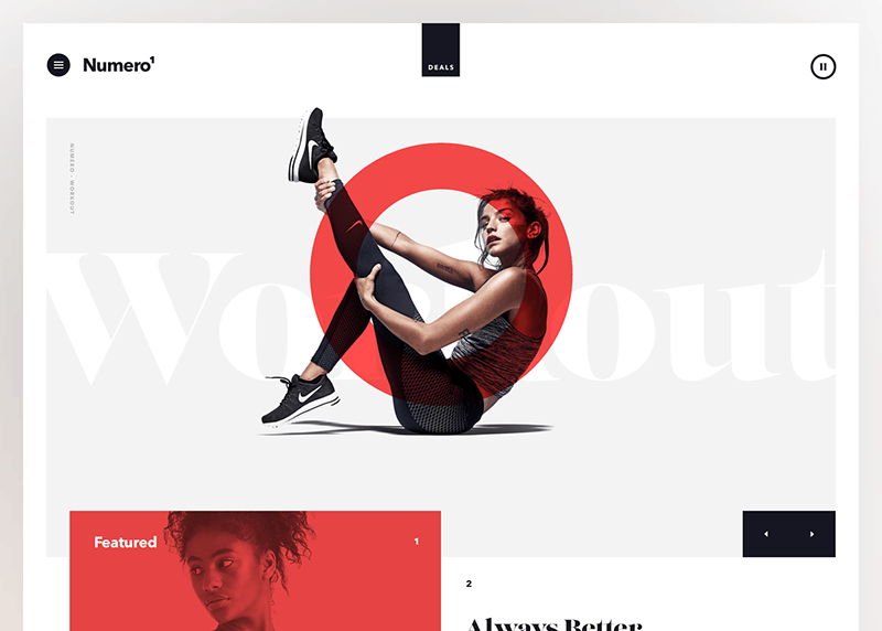
One of the latest web design trends for e-commerce sites is using micro animations to enhance user experience and give shoppers a taste of their products. This yoga clothing store is already using micro animations to show shoppers how their clothes fit and move on real people:
13. Organic Shapes
Geometric shapes were a big website design trend in 2020, but in 2022, it’s all about organic shapes. Organic or fluid shapes are anything that doesn’t involve straight lines. Think of the shapes that happen in nature, like hills, the edges of a lake or river, and how they are asymmetrical and winding.
Fluid shapes are a great way to break up sections of a website without harsh lines or angles. They’re also great to use in the background, like how Android uses circles behind products on their homepage:

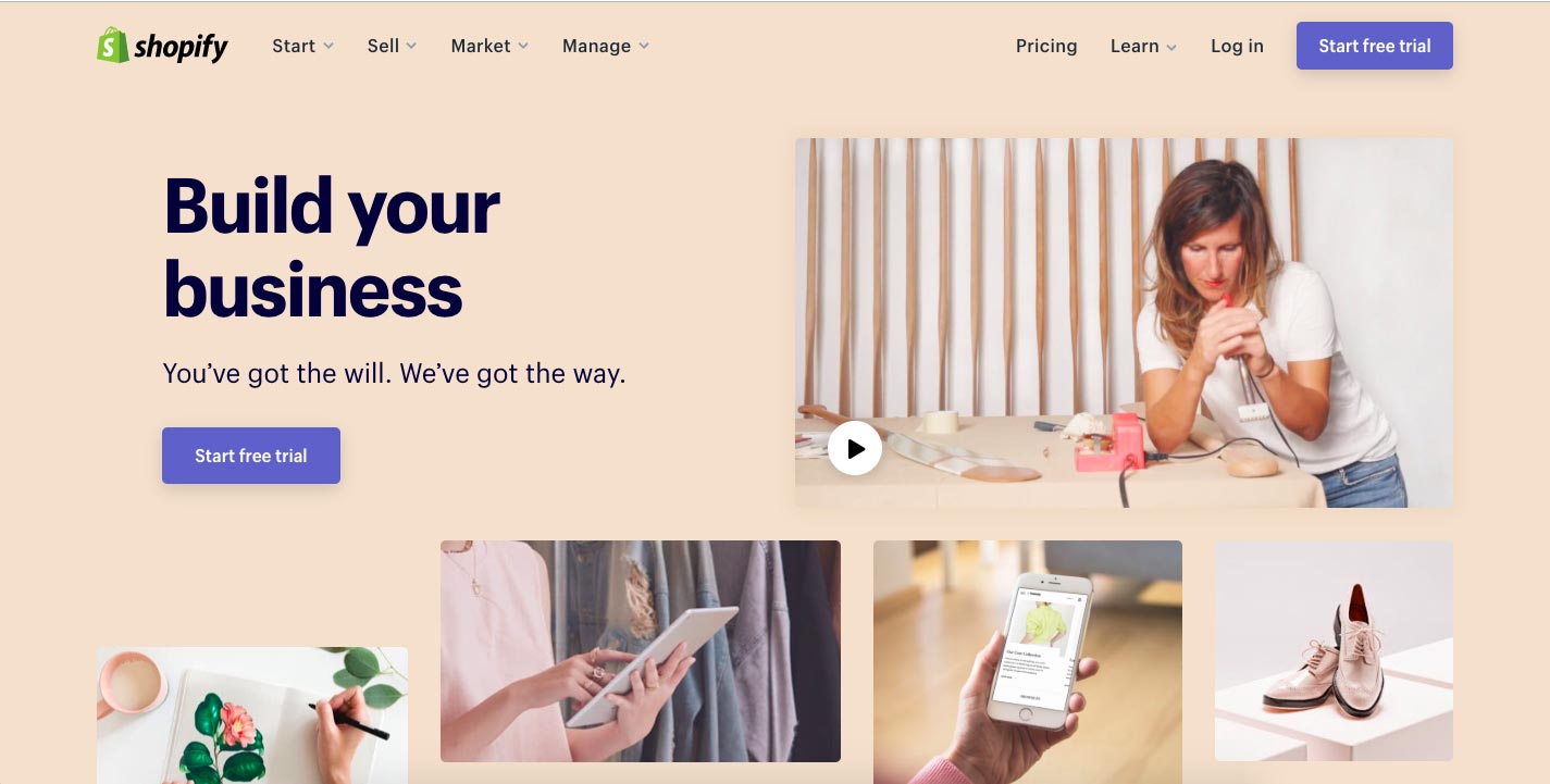
14. Minimalism (Flat Design)
Minimalism, sometimes called “flat design” isn’t a new trend in web design. Still, it has typically been associated with a lot of white space (think Apple.) In 2022, we expect people will be experimenting with colorful minimalism. It doesn’t have to be all white to be minimalist.
A great example of a site that does colorful minimalism well is Shopify. Each page of their website features a bold background color with clean text and minimal design elements to create an attention-grabbing and easy-on-the-eyes page. They’re proof that minimalism doesn’t have to be stark or boring.
15. Color to Evoke Certain Moods
Along with bold color, we think using color mindfully to evoke certain moods will be significant in 2022. Color psychology, the study of color’s impact on human behavior, has been around for centuries, and marketers have used it to help sell for nearly as long.
While the way we interpret colors has a lot to do with our perceptions, some general feelings are associated with colors. For example, green typically denotes nature and natural products while red symbolizes energy and passion.
In 2022, we think web designers will focus on using color mindfully to evoke the mood(s) and feeling(s) a site is meant to elicit.
Want to Improve Your Website Performance?
We can provide a personalized website assesment and one on one consultation.
REQUEST A FREE WEBSITE AUDIT
16. Thumb-Friendly Mobile Navigation
Responsive design isn’t an option anymore. Your site should work well and be easy to use on mobile devices. But in 2022, web design will continue to be focused on creating websites that are thumb-friendly.
What exactly is “thumb-friendly”?
We’re talking about the way we use our phones. If you’re reading this on your phone right now, look at how you’re holding it. Your fingers are probably wrapped around the back of your phone (or around a phone grip), leaving your thumb to do all the work. You probably look like this.
Spooky, huh?
Not really. That’s how most of us use our smartphones, and that’s why thumb-friendly navigation is essential. Putting the navigation bar, menu, and even contact buttons in the space your thumb can reach (the center of the screen) makes your site more comfortable to use and improves your UX tenfold.
Here is a great graph showing the thumb-friendly areas of a phone screen:
17. Smart Video
Video has long been touted as a must-have for websites. People love videos! Video is engaging! It’s the most effective online marketing tool!
While video is great, it needs to be thought out. That’s what smart video is about: video with a purpose and meaning. Gone are the days of embedding a YouTube video on your site just to have one. One well-thought-out, high-quality video is better than a dozen haphazardly assembled ones.
The way CEI uses video in their hero image is eye-catching but not intrusive. It is also a fun visual representation of what they do: provide affordable printers and copiers to businesses in Raleigh.
18. Material Design
Material design is a design language that was introduced by Google back in 2014. Traditional web design looks flat. Material design is about using color and shadows to mimic the physical world and its textures.
Google’s icons for its software suite is an excellent example of material design:
The shadows on the Gmail envelope and the calendar are especially good examples of material design. It’s very subtle but goes a long way in making the icons look three-dimensional. We expect to see a lot more material design in 2022!
19. Text-Only Hero Images
Newspapers always put their most eye-catching, important information “above the fold” to increase sales. The website equivalent of this is at the top of a page and is called the “hero section.” A current trend to catch internet users’ attention who are bombarded by different web pages every day is removing the typical background image in the hero section and replacing it with eye-catching typography. A bold, unique font could be just the thing to get a user’s attention quickly.
20. Vintage-Inspired Colors & Typography
It’s true that the older we get, the more we look to the past as a time that was simpler and better. Tapping into an audience’s sense of nostalgia doesn’t merely create a throwback on the webpage; it mixes vintage pieces with modern style. Try mixing vintage-inspired fonts and colors with contemporary imagery for an ultra-trendy look.
21. Bold Fonts
Visiting a lot of websites for leading corporations will show you that bold typography is on-trend. With heavy, bold fonts, the reader is instantly aware of the message, not necessarily the imagery. Combining these large fonts with neutral colors further emphasizes the headlines, quickly becoming an “image” of their own.
22. Data Visualization
Communicating data in an engaging way is a struggle. But the struggle is worth it, because using data visualization takes advantage of the fact that humans are visual creatures, and still conveys the message you need to get across. Data visualization creates images out of your data that engage your reader and makes them want to learn more about your brand. Infographics and graphs are some of the most popular ways to bring data to life.
23. Dark Mode
Dark mode web designs serve a couple of different functions. On the practical end, they help reduce eye strain, a concern for many as we are spending more and more time looking at screens. On the aesthetic end, dark mode easily creates an ultra-modern look for your website while giving you the ability to highlight other design elements just by darkening the elements that surround it.
24. White Space
The use of white space is about giving content room to breathe, not trying to cram the most information possible on the screen. The experience is more relaxing for your website visitors, the content stands out better, and readability is improved.
White space is just the term for the spacing we give between elements. It does not have to be white, as long as the area is empty. This is why it’s also known as “negative space.”
25. Illustrations
Sometimes browsing the web feels like seeing the same stock photo used across many websites. It can make a website feel generic and bland.
Custom illustrations can help your website stand out and feel like something fresh to website visitors. Since you will be creating illustrations from scratch, they can more accurately represent your company and branding, and enhance the page’s subject matter.
26. Full Height Homepage Hero
Like a giant billboard, making your homepage hero section full-height can focus your users’ attention and serve as distraction-free messaging.
Think of full-screen hero sections as an opportunity for great storytelling. Just keep in mind that images will crop differently based on browser dimensions. You should use an image that will accommodate accordingly.
27. Blending Photos with Graphical Elements
You might have noticed overlapping graphics on images in your social media feed. This mixing technique brings a level of creativity and fun to a typical image.
The trend is also catching on with websites. Mixing photography with graphics can reinforce your company branding and keep website visitors engaged with your content.
28. Gradients
Gradients are a long time trend that has evolved from subtle color overlays to eye-catching backgounds.
Gradients can be used to add depth, serve as a striking background, or subtly to add texture to an illustration. We increasingly see it used in bigger and bolder typography.
This trend has staying power. We’re excited to see the continual evolution of its use on websites.
29. Interactive and Static 3D Content
Thanks to maturing web technology and web designers wanting to stand out from the average webpage, 3D elements that users can interact with have been increasingly used.
The results can be breathtaking – like the use of interactive 3D content on the Campo Alle Comete website.
30. Frosted Glass Effects
Recent advances in web technology have allowed the easy implementation of the frosted glass effect on websites. The blurry appearance of elements behind the frosted glass overlay helps add color to an area while also allowing text or objects to appear over the image and remain readable.
The effect has become a popular option in a designer’s tool belt and increasingly been used as a background in place of gradients.
Ongoing Web Design Trends and Website Development Standards
There are a few popular trends from the past few years that will continue to be significant in the upcoming years.
1. Mobile First Design
We mentioned that responsive/mobile-friendly web design isn’t optional anymore. Your site should be designed with mobile in mind first. Mobile searches overtook desktop searches way back in 2015. Since the beginning of 2017, mobile traffic has accounted for nearly half of all web traffic worldwide. More than good UX, Google has ranked mobile-friendly sites more favorably since 2018. Yep, mobile-first design is another drop in your SEO bucket.
2. SSL Certificates
SSL certificates are less a trend and more of a standard security measure for websites. SSL stands for Secure Sockets Layer, and the certificate is installed on your web server. It serves two purposes: it authenticates the website’s identity, which guarantees visitors that they’re not on a bogus site, and it encrypts the data being transmitted.
This ensures a private “conversation” between your website and your visitors. If your site doesn’t have an SSL certificate, getting one should be a priority in 2022, especially if you own an e-commerce site!
Comments